To start off the theme of force we were given the task of choosing three famous photographers and analyzing some of their photographs. The three photographers I chose were Steve McCurry, Dorothea Lange and Brassaï. I found this assignment very interesting as all three of these photographers have different styles which i was able to compare to each other.
Steve McCurry
Steve McCurry was born in Philadelphia he graduated from the college of arts and architecture at the Pennsylvania state university. He worked at a newspaper for two years. He then began free lancing in India.
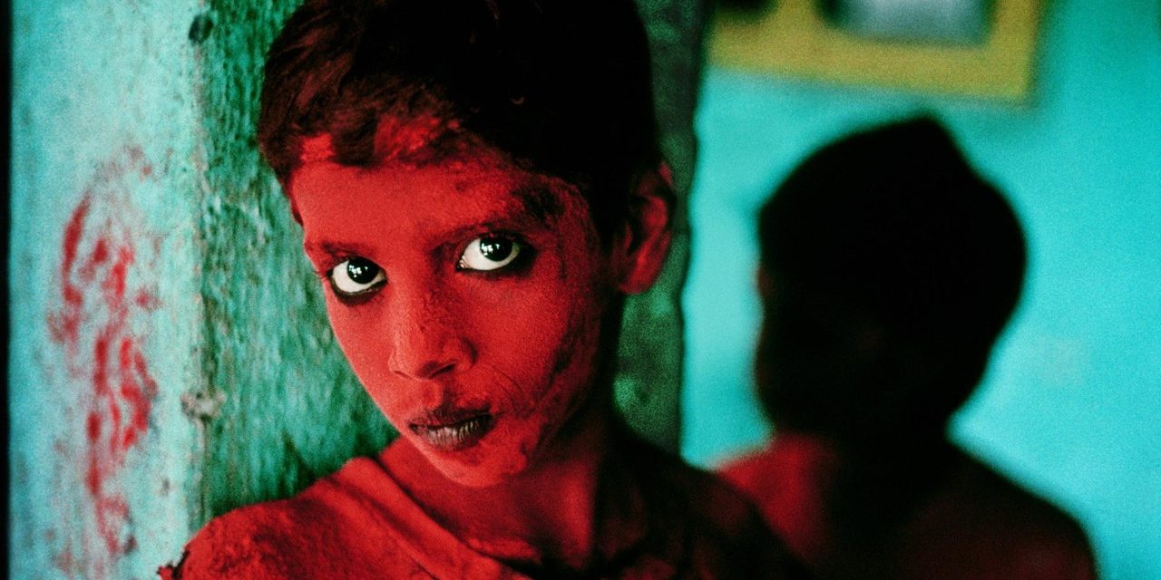
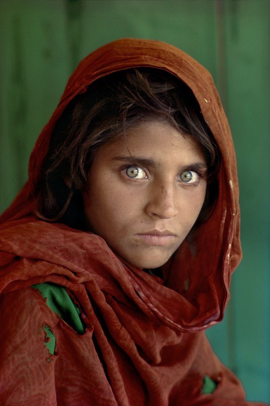
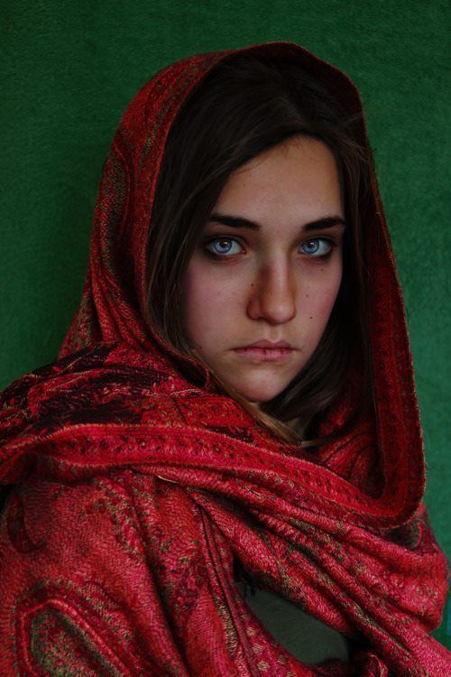
His career as a photographer took of when he spent 4 decades exploring Afghanistan and documenting his time there taking photos of the people and landscape. His goal was to capture the conflicting traits of war and peace. He managed to sneak his photographs out of the country by sewing the rolls into clothing. His images were shared all over the world and he received the Robert Capa Gold Medal for best photographic Reporting from Abroad; an award dedicated to photographers that show great courage and enterprise. He won many other awards including Magazine Photographer of the year by the National Press Photographers Association, four first prizes in the world press photo contest an the Olivia Rebbot award twice.
McCurry has featured many areas of international civil conflict e.g the Philippines, the gulf war and Tibet. He focused on the impact war has on people and how it shows in their faces.
I chose these three photos in particular as the colors are very vivid and bright which makes the images very appealing. However by using these colors his photographs draw attention to the eyes of the subjects which tells their stories of suffering, fear and sadness.
Dorothea Lange
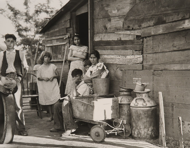
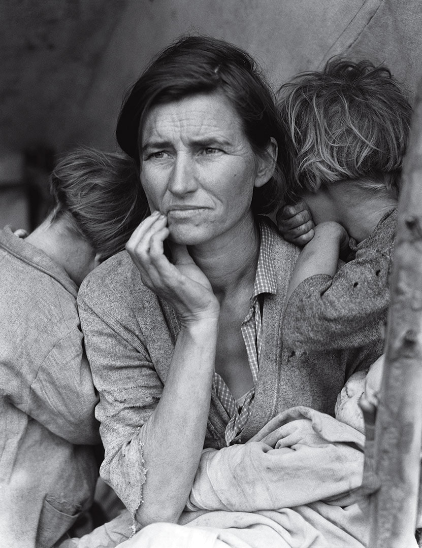
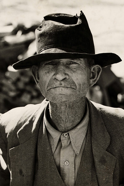
Dorothea Lange was born in New Jersey in 1895. She graduated from columbia university. when she was 23 she opened a portrait studio in San Francisco. Her most famous photos were taken during the great depression and WW1.
Dorothea Lange creates photojournalism images. She does this by taking neutral detached images which creates powerful images. She wants us to consider the pain and suffering people were going through during the great depression.
Lange wanted her photos to make a difference in society. This is shown by the raw, unchanged truth in the images. She was interested in this issue because she had a desire to effect social change by informing the public of suffering in different places.
Dorothea Lange has used black and white film, even though colored film was during this time, when creating this work. By taking these photos in black and white it shows hardship and implies that there happiness has disappeared and they can only see in black and white.
Brassaï
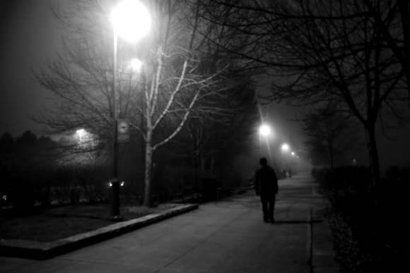
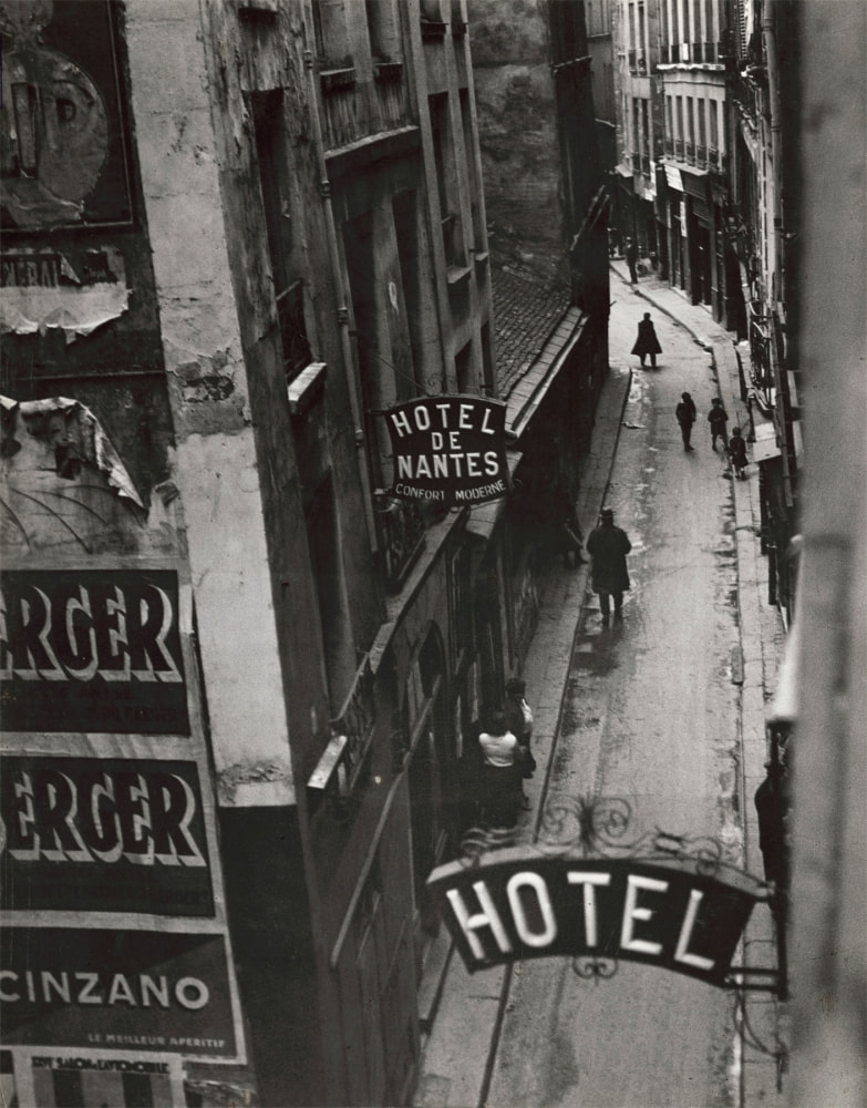
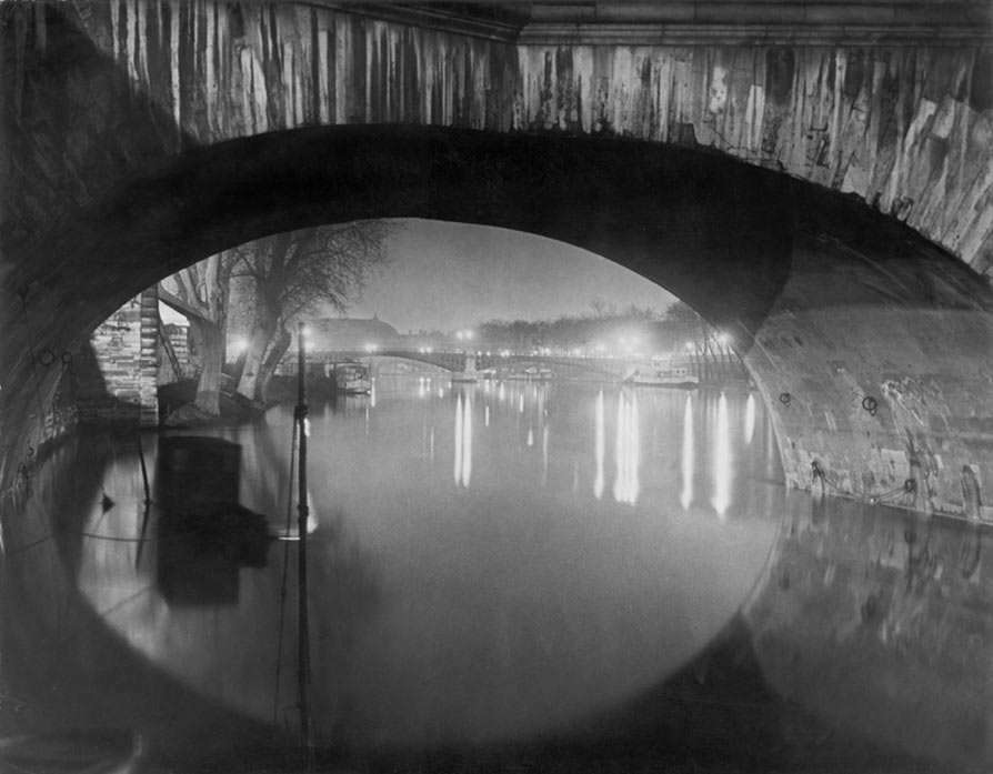
Brassai grew up in Transylvania. He studied art at the academies of Budapest and Berlin. He then moved to Paris in his mid-twenties where his career flourished between the world wars.
He was an urban photographer who took black and white photos of the streets. They were his canvas and he wandered round them late at night looking for inspiration.
When looking at Brassai's images you get a eerie and mysterious vibe from them and the bright white streetlamps create a greater contrast to the night making it appear darker.
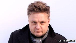
About Ian Rankin
|
Ian Rankin was born in Glasgow in 1966. He grew up in Hertfordshire. He studied Brighton Polytechnic and this was were he realized his passion lay in photography so he joined Barnfield College and later went to London college of printing.
|
Ian Rankin 'destroy'
This term we have focused on Rankin's project "destroyed". For this project Youth Music teamed up with Rankin and asked musicians and visual artists to destroy their own portraits taken by Rankin himself. This created an original piece of work produced by the artists themselves.
His idea behind this project was to be "more truthful to the artists impression of themselves" as he said himself photographs are a lie and are "fabricated".
His idea behind this project was to be "more truthful to the artists impression of themselves" as he said himself photographs are a lie and are "fabricated".
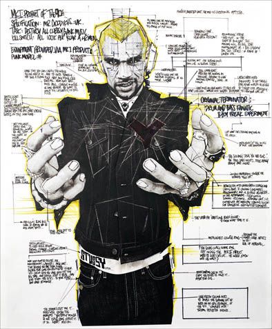
I've chosen this image to analyze as I like how the celebrity has chosen to do a mind map of words around his image pointing out different things. This draws the observers eye to different aspects of the image. Also his hands appear bigger than the rest of his body due to the angle in which the image was taken. It's as if the hands are going to reach out and grab you.
My response to Rankin 'destroy': celebrity
We used Rankin's photos as inspiration and created our own. I choose Donald Trump. I created this image by using newspaper and paint. I think this achieved the aim of the project however if I did it again I would try and make the picture a bit more intricate as, in Ian Rankin's photos they are very busy and have a lot of things to think about.
My response to Rankin 'destroy': myself
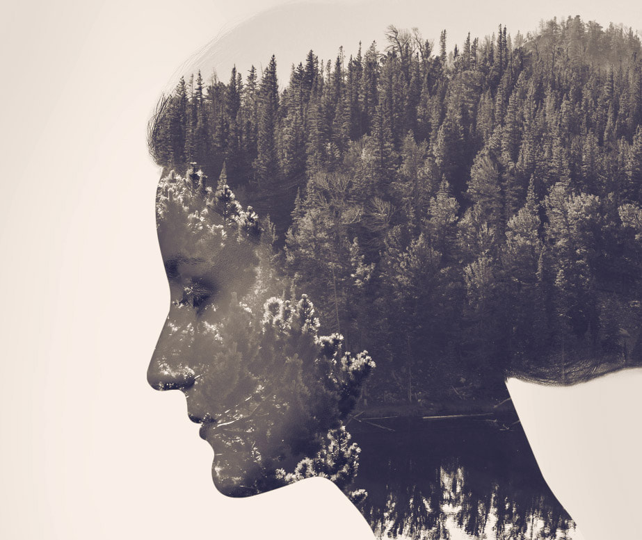
Double Exposure
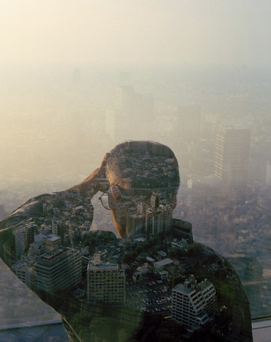
Christoff Relander
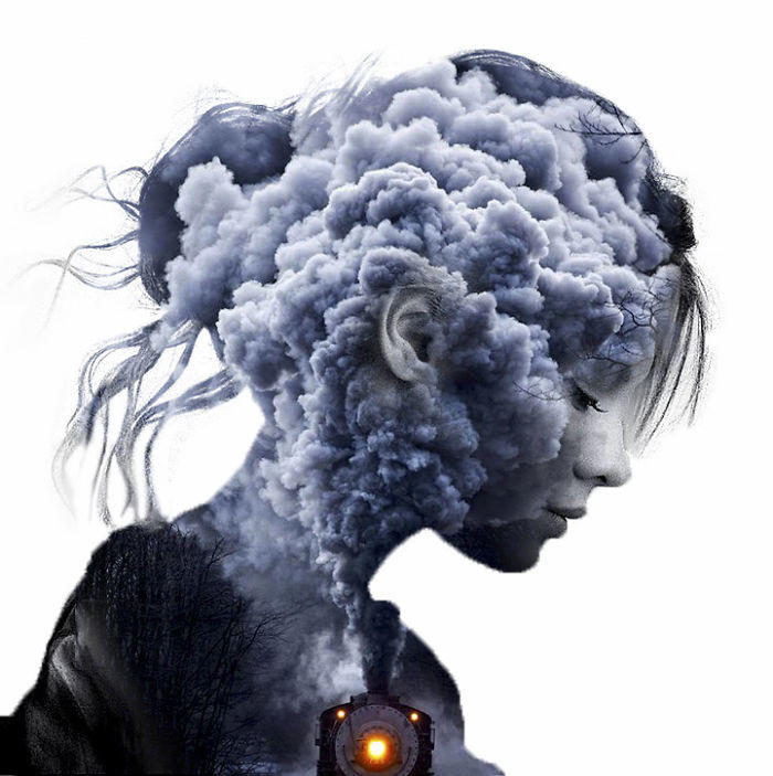
Christoff Relander was one of the photographers that inspired our work. He was born in Finland in 1986. He showed an interest in art from a young age but it was only when he served in the Finnish marines that he found his interest in photography.
He is currently a professional photographer. Relander is most famous for layering images and creating multiple exposures. His work shows the link between humans and nature and also shows that your experiences and surrounding can help define who you are. His work has been shown in many different galleries around the world including Russia, Finland, Norway and the USA. Also Relander's work has appeared in many magazines and websites.
I really like the middle image as it has a really interesting texture, the mix of greys and blues in the clouds set a dark tone to the image. It shows a more dangerous aspect to nature as it looks like a forest fire, also the girl in the picture looks defeated. Through this Relander could be trying to convey the negative impacts we have on our forests and our suffering in result of this.
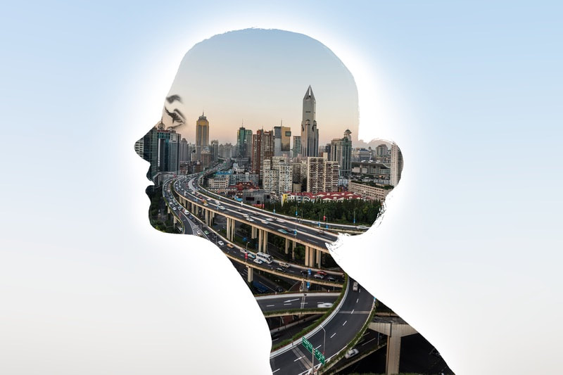
Jasper James
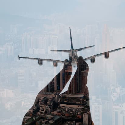
Jasper James is another photographer who inspired our project. He originated from the UK but is currently living in Beijing. He is well known as a naturalist photographer and has been focusing on photography for around 20 years. He spent 3 years in London college of printing and worked as a photo assistant for many photographers. He has been working as a commercial photographer in many different areas of it e.g fashion, travel and advertising. Over the years he has worked on many projects for leading magazines and advertising clients like Ferrari, British Airways, Vanity Fair and wringley's.
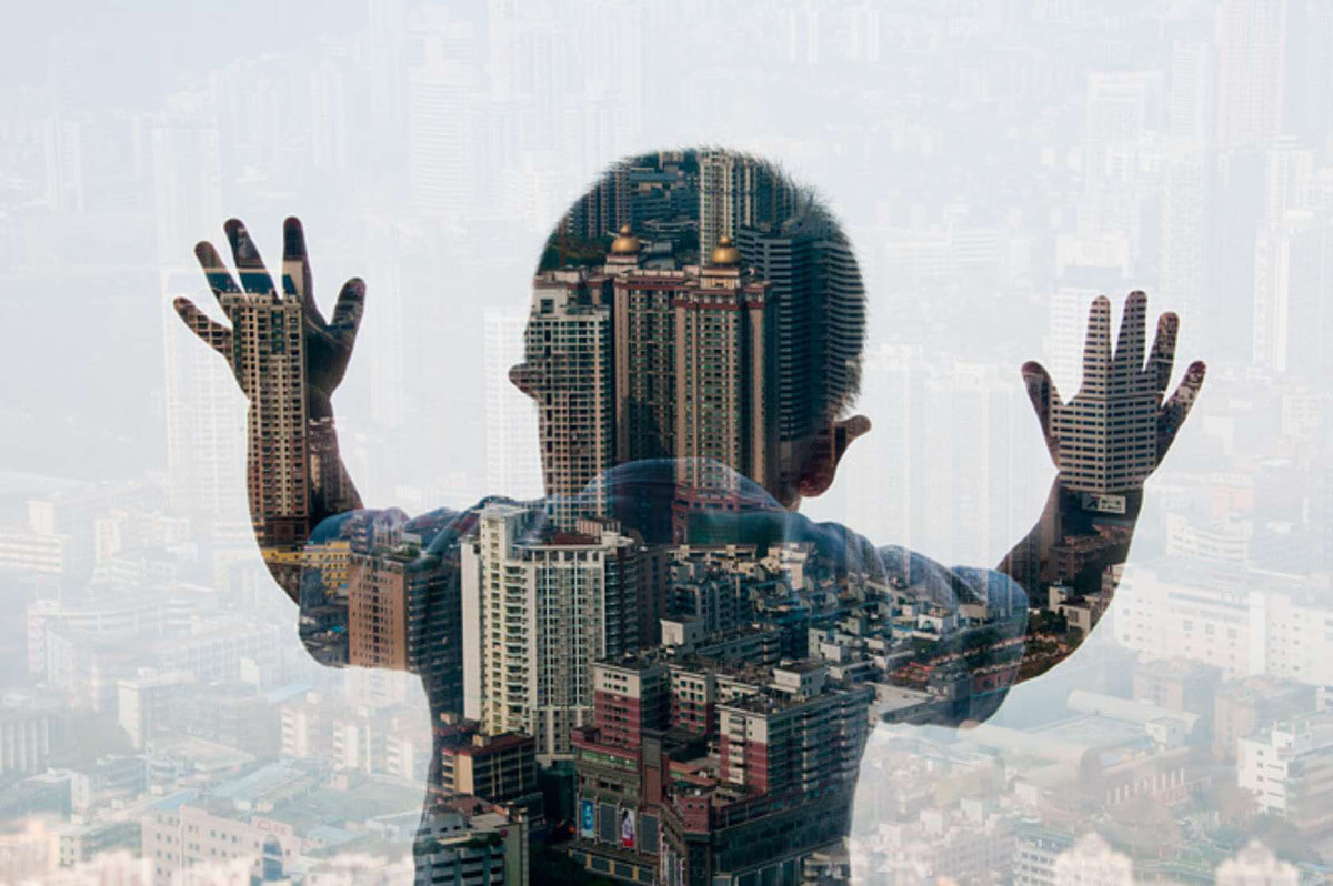
Jasper James is well known for his "city silhouette series, which uses the technique of multiple exposure to incorporate portraits into the birds eye view of cities.
I particularly like the images above as they are all unique and shows different silhouettes of people looking down onto the city. This creates a sense of unity as it implies that the city is home to a range of contrasting characters e.g old and young all enjoying the same place. In these images the use of a birds eye view lets us depict the different areas of a city. I particularly like the technique he has uses where a part of the image is unfocused to create a background while the silhouette is in focused directing us to the part of the picture we should be paying attention to.
Comparison between Relander and James
Both Relander and James use the technique of double exposure in their images. However, while Relander focuses on nature and in particular forests, James focuses on man-made landscapes. As well as this, Relander crops his landscape image inside so it's only in the silhouette and has a white background. Jasper James uses the whole landscape image but blurs all but the landscape inside the silhouette.
My Response
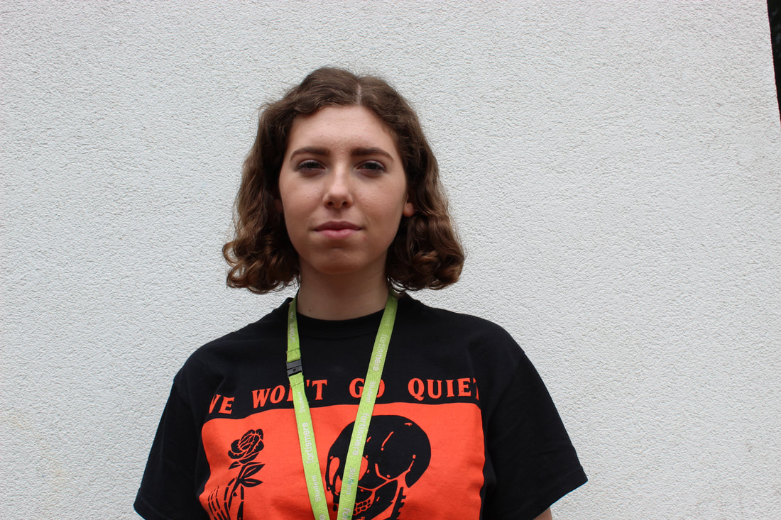
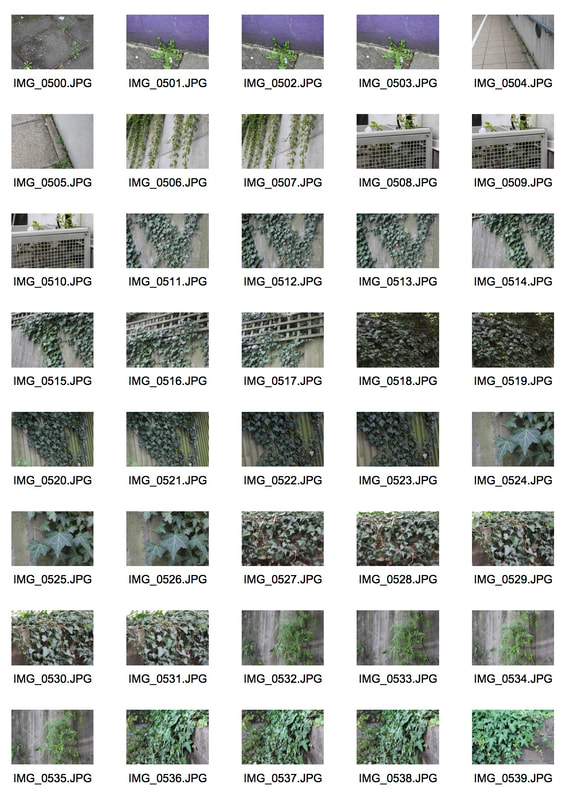
For this task we were asked to take photos of nature and then take different profiles of our subjects. This would create a double exposure image. Double exposure is two or more exposures creating a single image. I particularly liked this project as enjoyed trying out this technique of photography.
|
|
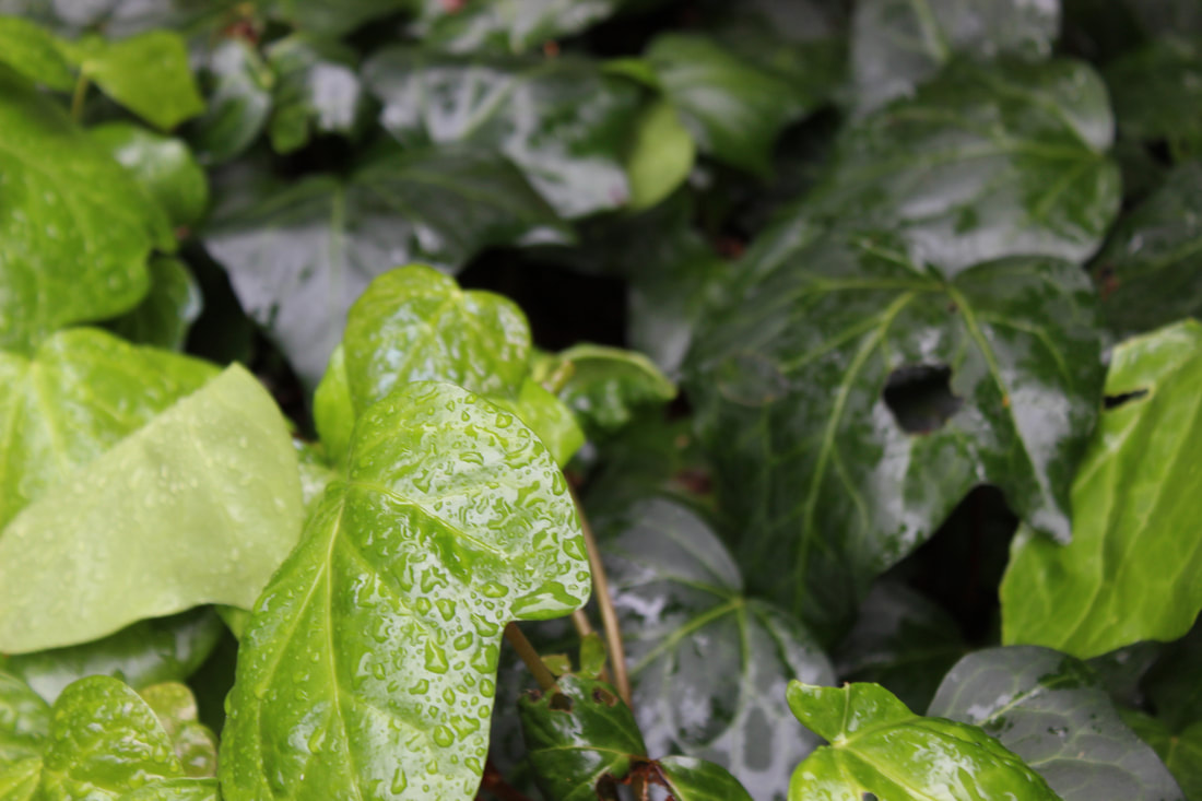
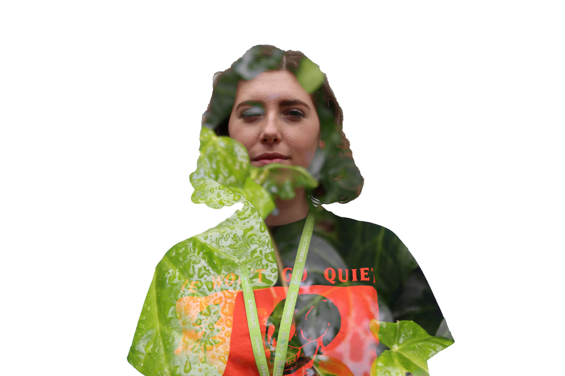
I am very pleased with the way this turned out and particularly as the droplets of rain on the leaves brings the photo more texture.
WWW: I think the colors compliment each other and I was able to achieve a successful double exposure image.
EBI: I was able to take more photos to practice this new skill. Also to make the leaves in the background stand out a bit more.
WWW: I think the colors compliment each other and I was able to achieve a successful double exposure image.
EBI: I was able to take more photos to practice this new skill. Also to make the leaves in the background stand out a bit more.
How to create double exposure images
First select the base photo for the image and to make it easier to work with make sure you use a neutral background. Duplicate that layer and then get rid of the background by using the magic wand, then go to select>inverse to invert selection. In the output section, select New Layer with Mask in the Output to options window, creating a copy of your image and hiding the the background without making permanent changes to your file. After that, click Add a Mask and then Create a New Layer. Move this new layer underneath the cut-out subject and fill it with white color using the paint bucket tool. Drag the second image on top of the first image. With the second image selected, press Ctrl key and click the Layer Clipping Mask button of the first image. You will then see the moving outline of the main subject's silhouette on the landscapes layer. Unlink the mask and move or rotate the second photo until the desired part is in the outlines silhouette. To blend the images together use screen layer on your second layer which makes the photo become transparent revealing base photo.
Force of nature
The relentless battle between man and natural environment that he inhabits is one that holds endless visual possibilities. The buildings and structures that man builds as symbols of prosperity and status are, at their basic level, simply a means of protection from the harsh environment that surrounds him.
|
|
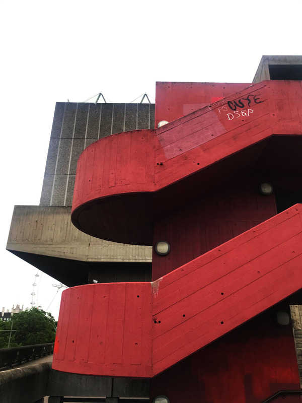
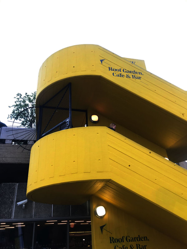
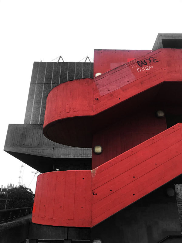
Simon Phipps
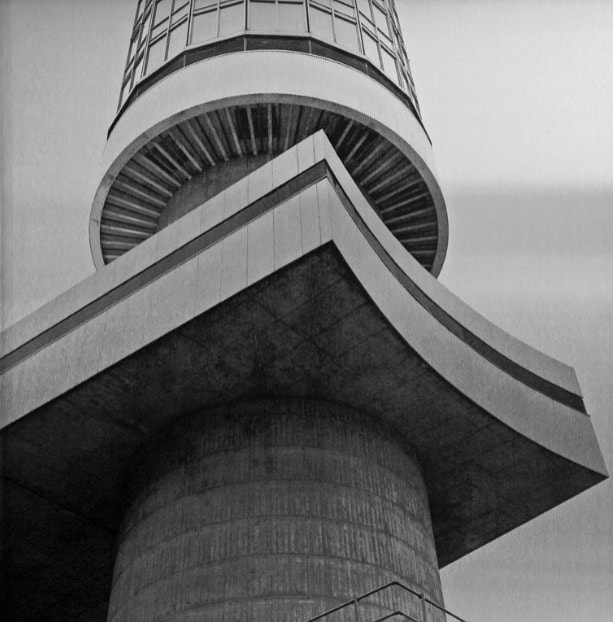
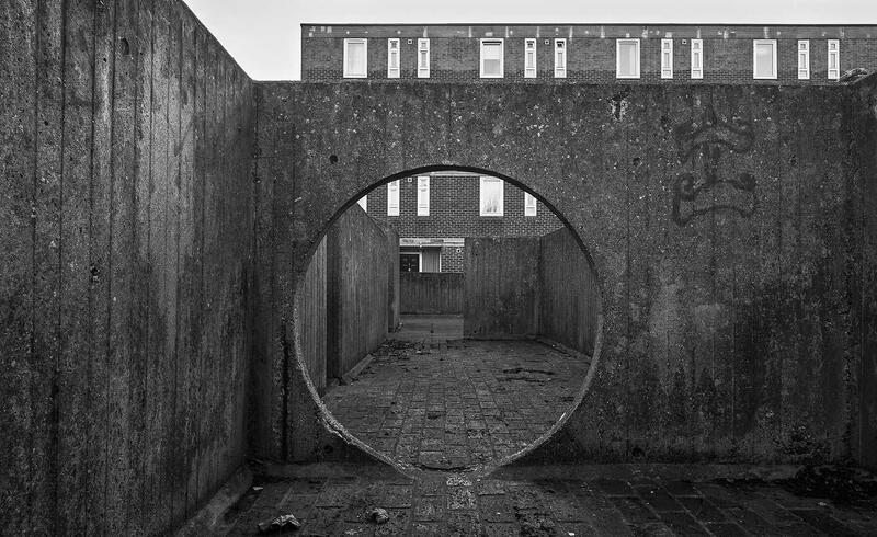
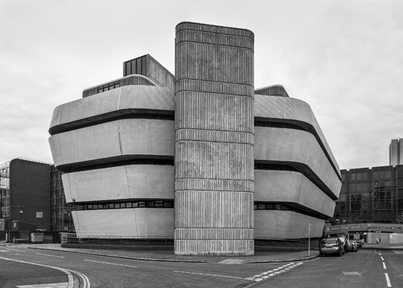
Simon Phipps creates brutalist photos. Brutalism is an architectural style which appeared in the mid 20th century this design is usually for institutional buildings such as libraries, courts, public housing and city halls. His photos show the buildings towering in the sky. He does this by taking his images at many different view points from close up to the building and looking up at it.
My favorite photo is the one in the middle as the circle in the center of the photo draws our attention to the exit. I also think the way this photo is lined up with the building behind it is really clever, this is because you are able to see the windows of the building in the background just above the front structure.
My favorite photo is the one in the middle as the circle in the center of the photo draws our attention to the exit. I also think the way this photo is lined up with the building behind it is really clever, this is because you are able to see the windows of the building in the background just above the front structure.
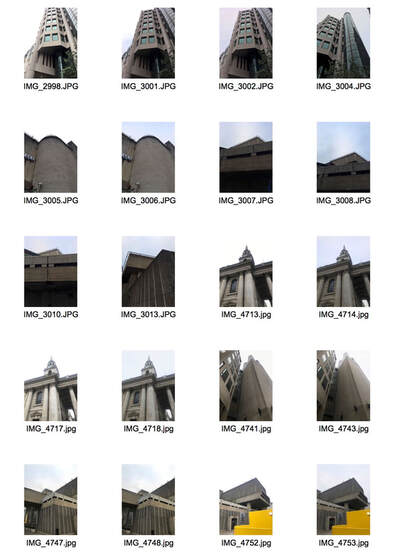
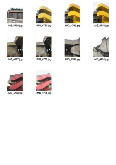
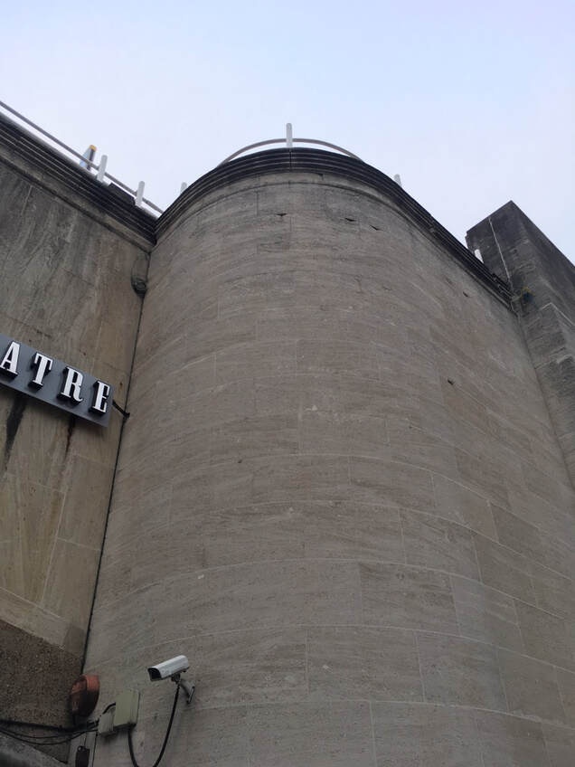
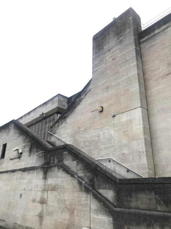
Force of architecture- Response to Simon Phipps
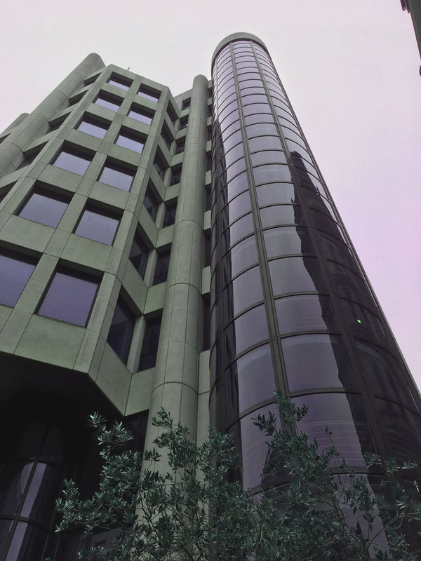
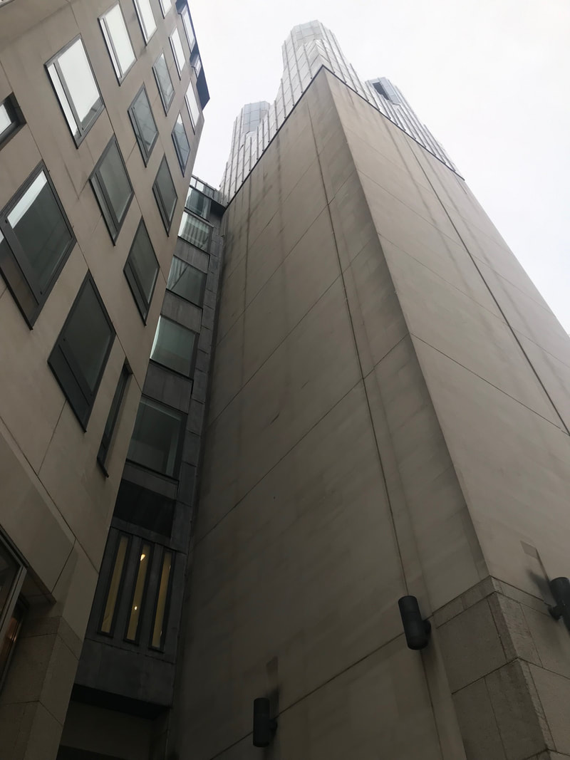
In this task we were required to photograph buildings from an angle that gave the impression they were bearing down on us. Specifically brutalist buildings. Brutalism is an architectural style of the 1950s and 1960s distinguished by simple, block-like forms and concrete construction.
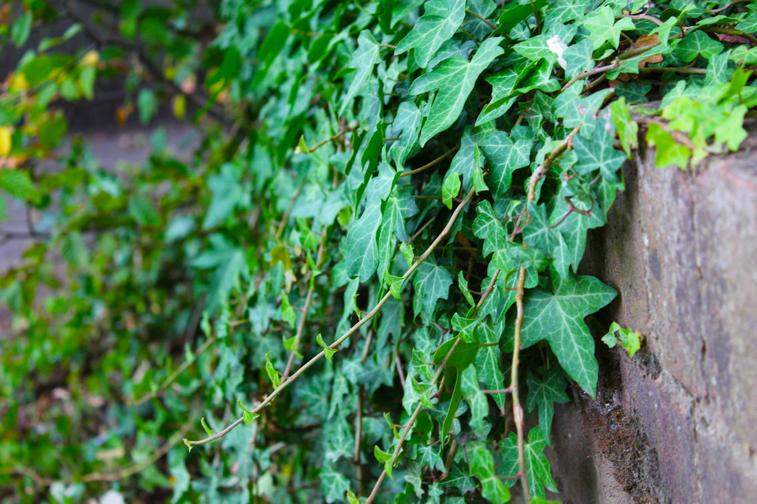
Down below is my response for this task. I took these photos along south bank as they contain a lot of these styled structures. I think the majority of these photos worked well as I managed to take them with the camera angled up. This technique highlighted the fact that the buildings were towering over me which made them appear intimidating.
Down below is my response for this task. I took these photos along south bank as they contain a lot of these styled structures. I think the majority of these photos worked well as I managed to take them with the camera angled up. This technique highlighted the fact that the buildings were towering over me which made them appear intimidating.
|
|
|
|
|
|
|
|
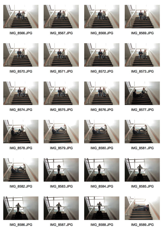
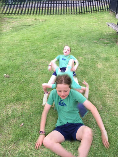
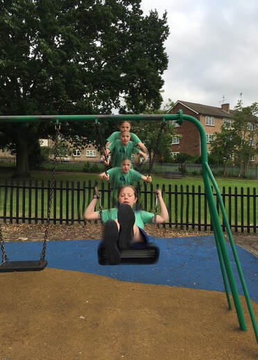
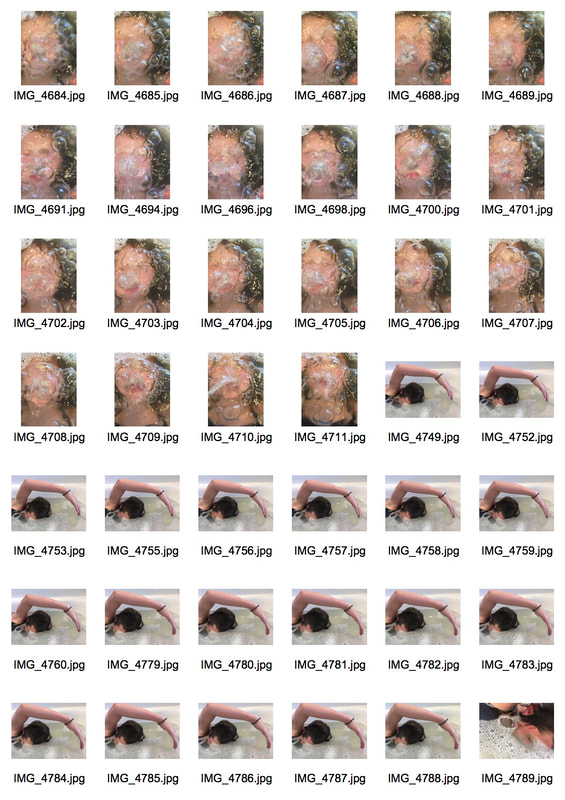
Force of movement- Response to Edward Muybridge
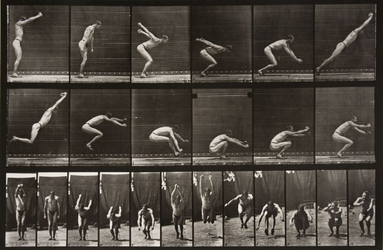
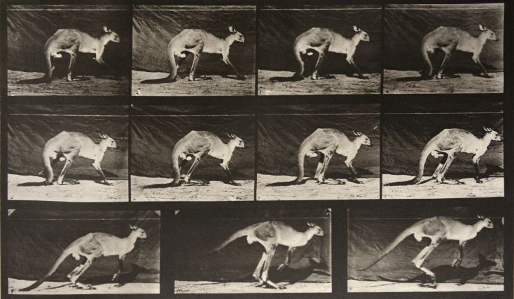
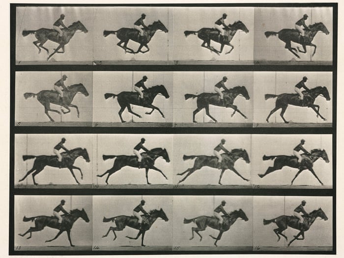
Eadweard Muybridge was born in 1830, and was one of the first photographers to experiment with multiple exposure, taking many photos in sequence. He aimed to capture 'motion in stop-motion images, and first used many cameras set up in a row to take photos of animals moving.
Force of movement
What the definition of multiple exposure photography?
Multiple exposure is the superimposition of two or more exposures to create a single image.
Multiple exposure is the superimposition of two or more exposures to create a single image.
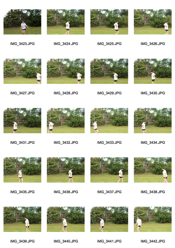
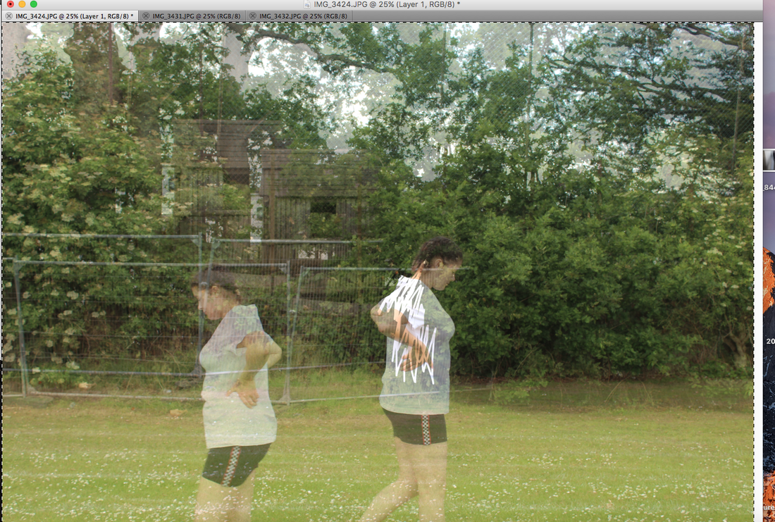
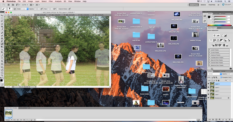
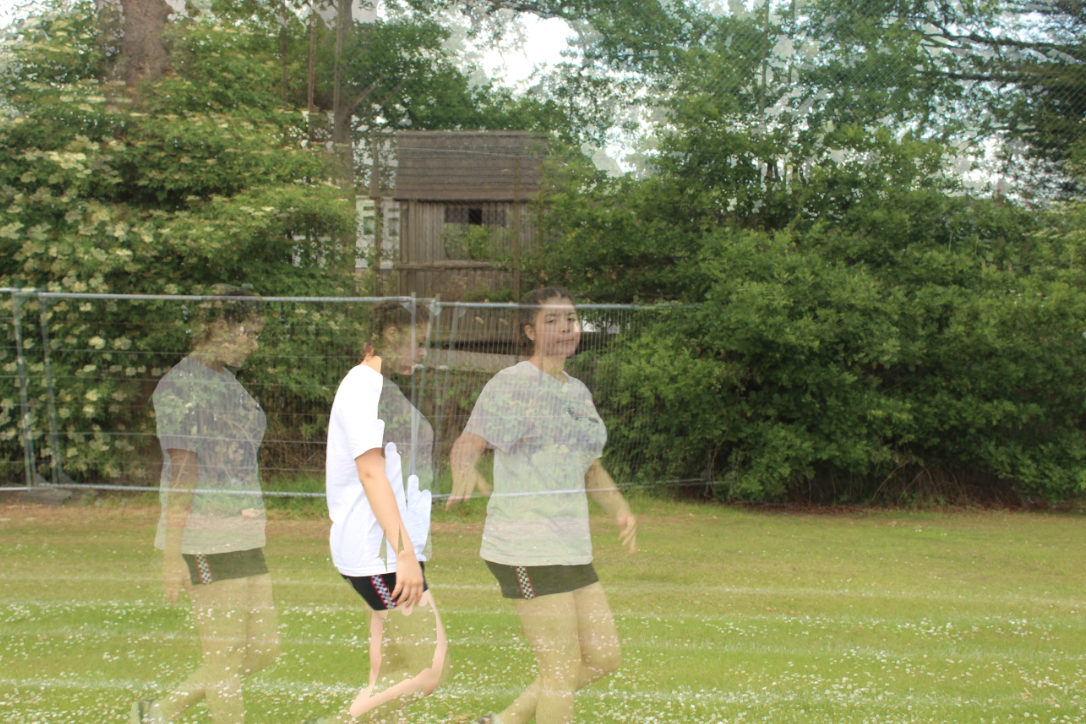
For this project we had to have the subjects of our photos move around so we could create a superimposed image. I decided to make Ella run around in south wing field to create my image. These are the original photos I shot.
|
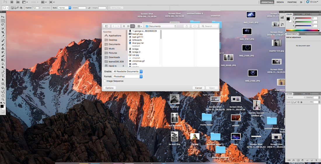
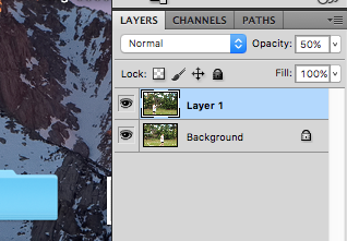
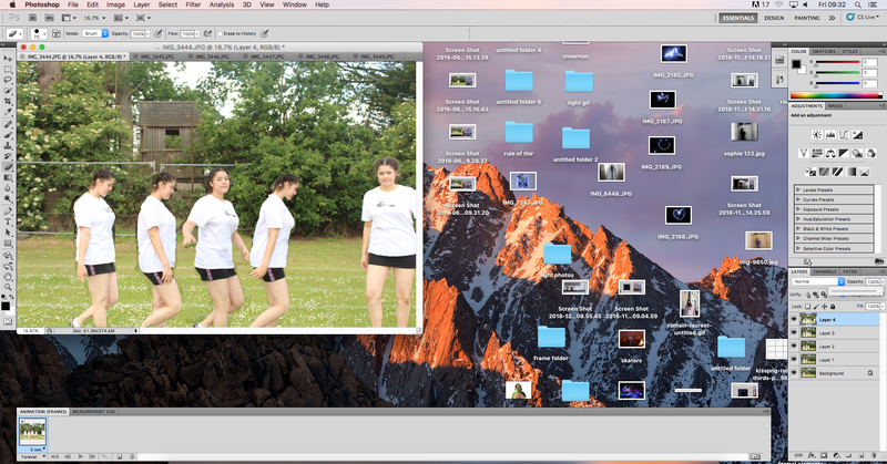
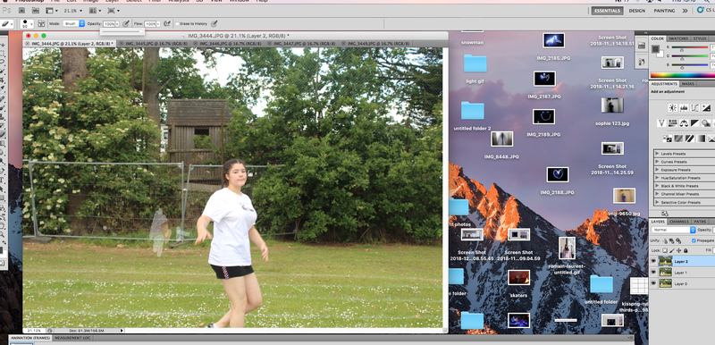
To create our multiple exposure photos, first we opened Photoshop and selected the photos we wanted to use. Then go on to your second photo and press cmd A which selects the whole photo and cmd C which copies it. Go onto the first photo (the background) and press cmd V. This will paste your 2nd photo onto your background. Turning your opacity down to around 50% allows you to see the second image as well as the first. The next step is to erase the subject of your second photo and this pastes the subject on top of the background so when you turn your opacity to 100% both of the subjects appear. Repeat these steps for the next layers and this will result in consecutive movement.
|
|
|
|
|

|
Final piece
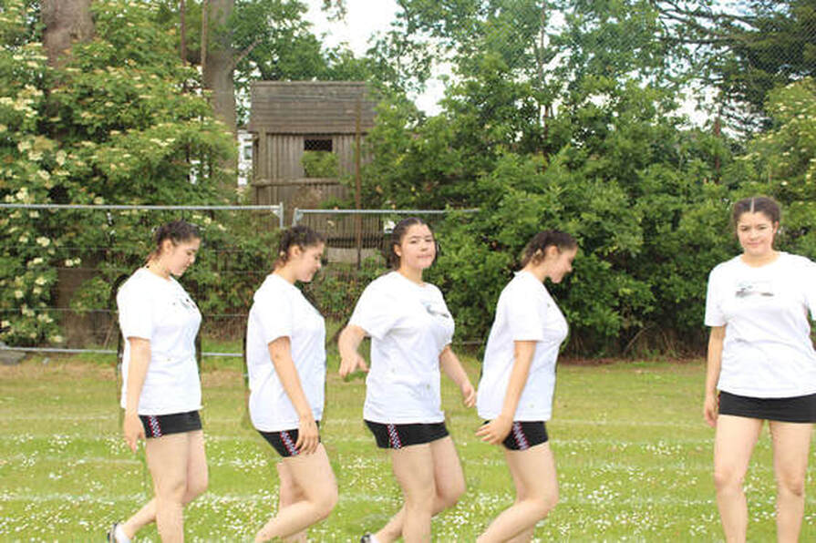
Overall I think my image achieved the criteria of the project however I think it could be improved. If I had the chance to take it again I would make sure the photo has more movement to make it more exciting. Also I would be more careful with the erasing tool because as you can see in the picture I have erased some of the background which ruins the illusion.
Three strands
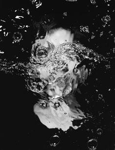
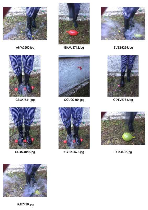
Strand 1: Force of water
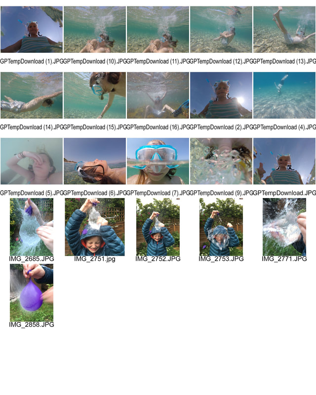
Final piece
Final piece
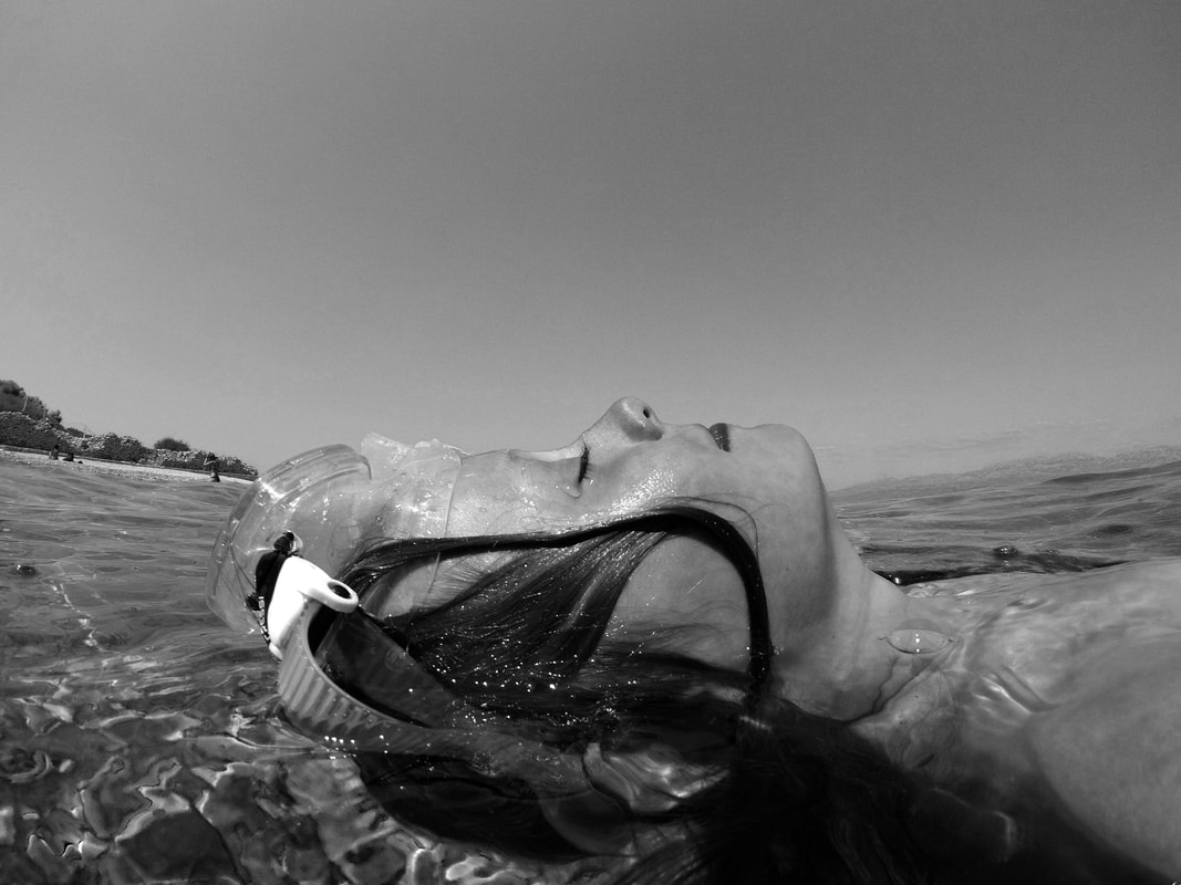
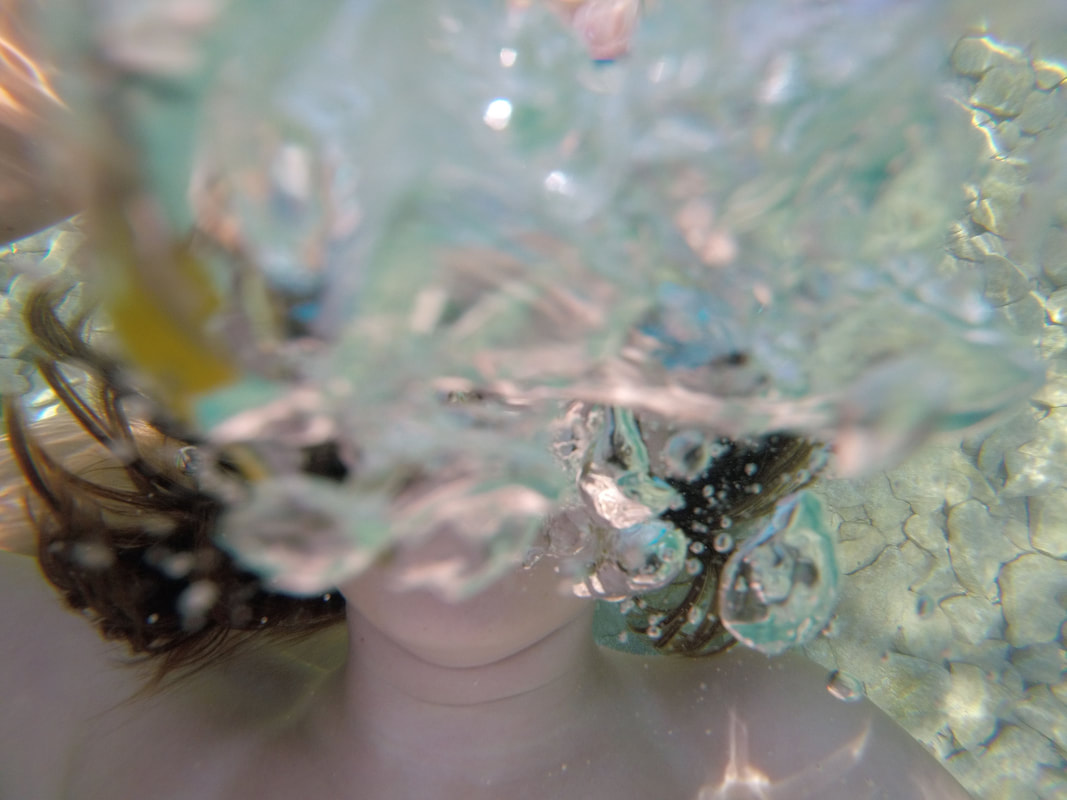
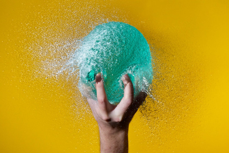
To create the images of the water balloon I set my camera on a high shutter speed and took a burst of photos which allowed me to capture the moment in which the balloon had burst but the water had not lost its shape. The other photos were taken In the sea using a go pro. I would like to use this water strand as my favorite strand.
WWW: I was able to show a range of examples of force of water
EBI: For my development I will developed the bursting of water balloons more
WWW: I was able to show a range of examples of force of water
EBI: For my development I will developed the bursting of water balloons more
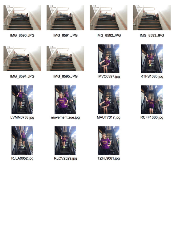
Strand 2 force of movement: inspired by Edward Muybridge
I wanted to re-do the force of movement project as the end result of mine was quite messy. Think these photo turned out better than my original.
|
|
|
|
WWW: I manged to put a series of photos together using Photoshop and was able to show the theme of movement.
EBI: I positioned my subject Further apart from each image so they didn't overlap because I accidentally rubbed out parts of the previous images
EBI: I positioned my subject Further apart from each image so they didn't overlap because I accidentally rubbed out parts of the previous images
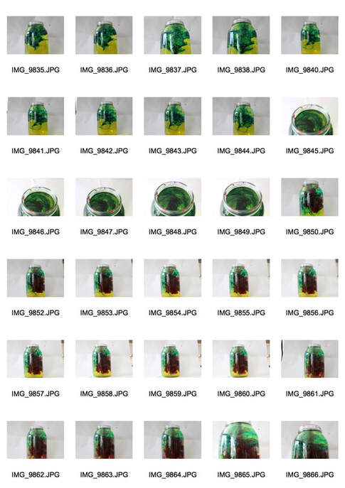
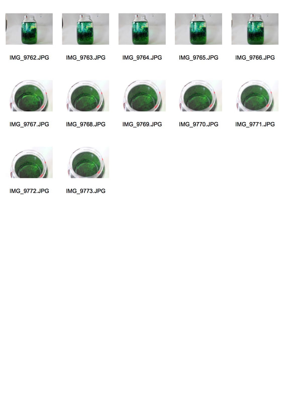
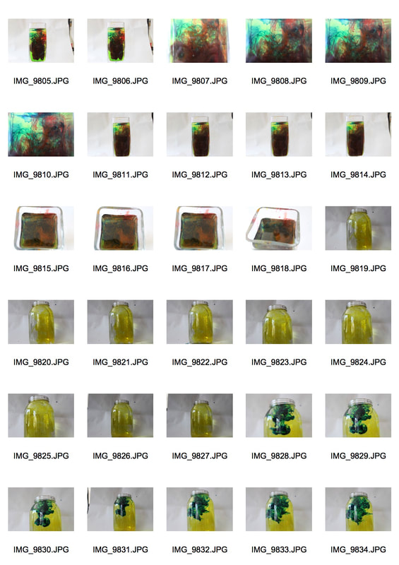
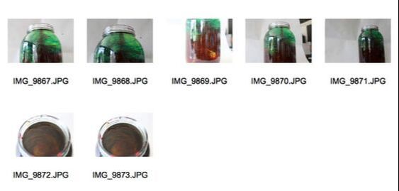
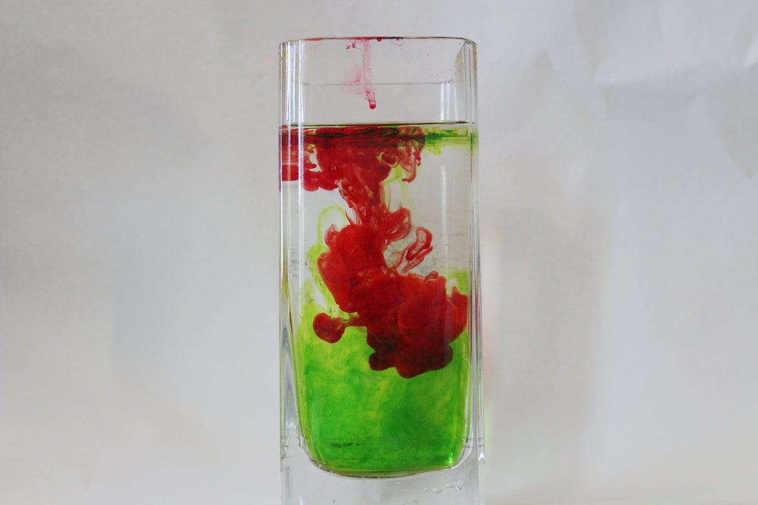
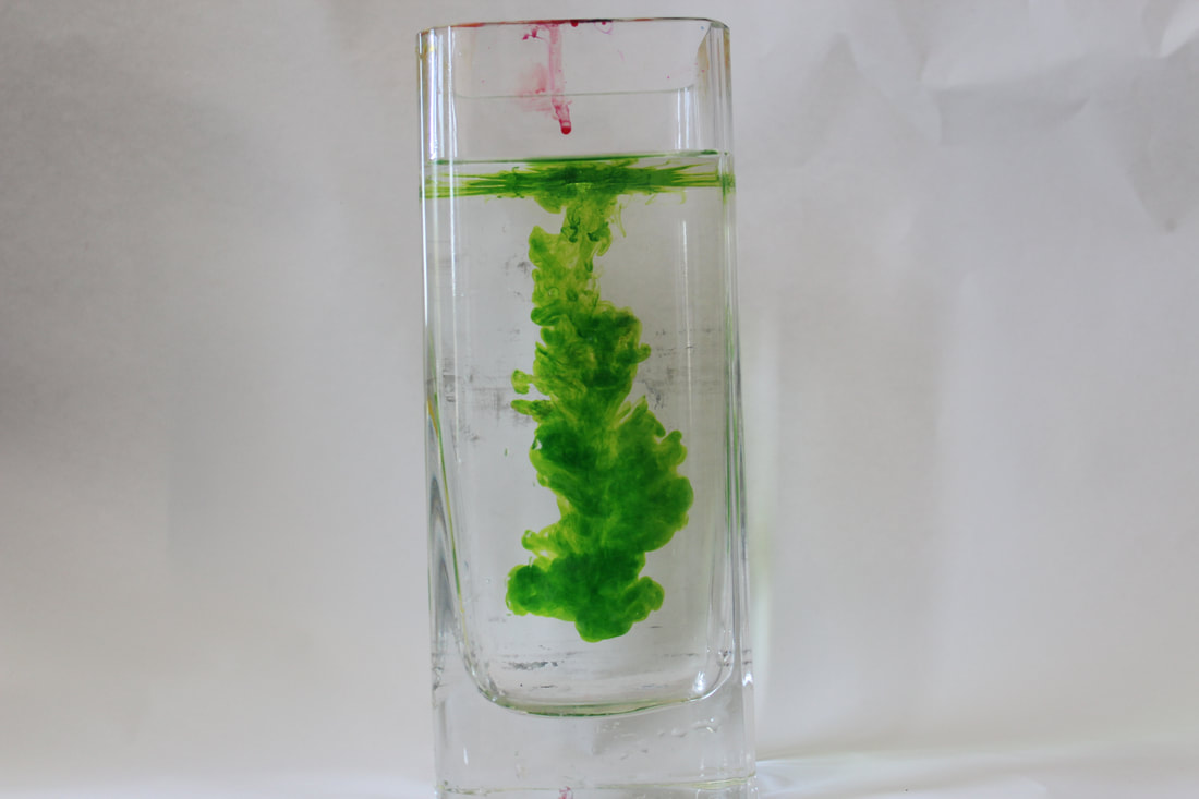
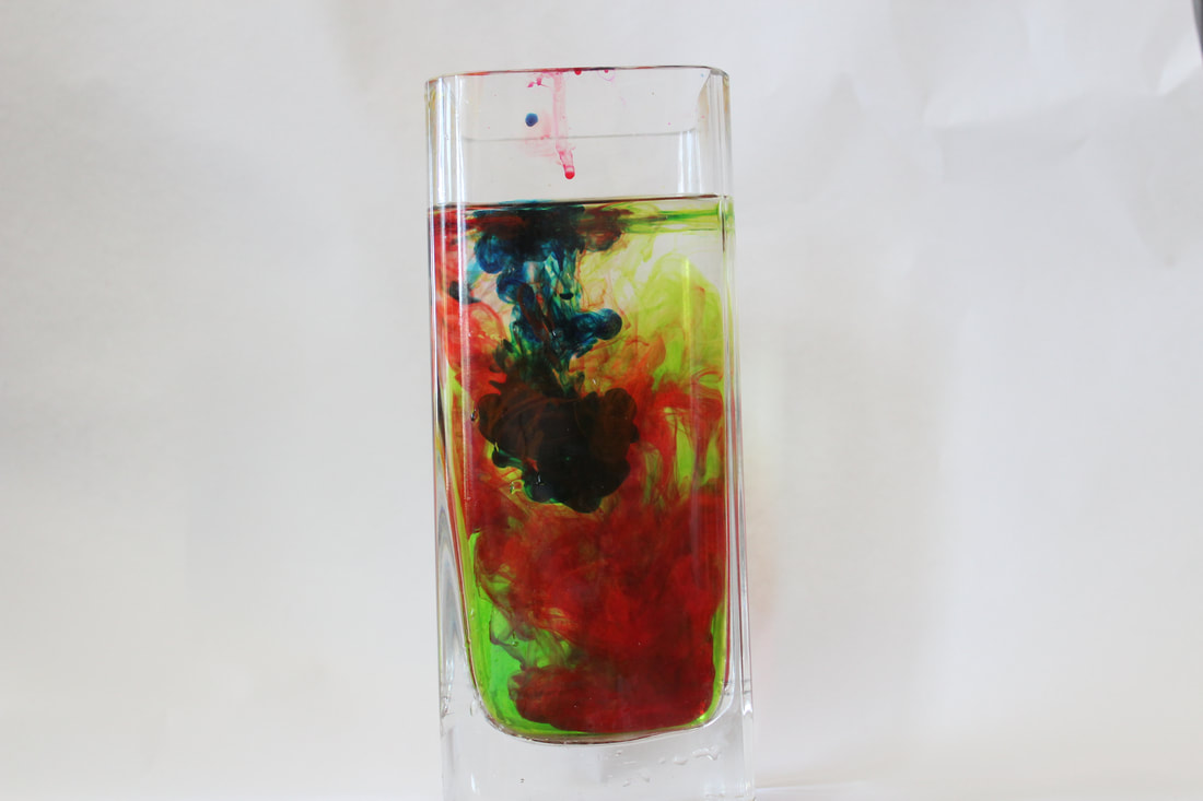
Strand 3 Colorful chemical Reactions: Dan Tobin Smith
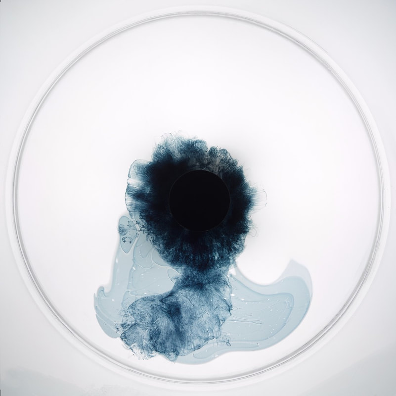
Dan Tobin Smith uses different colored ink, dropped in water to create his images. He creates mystical illusions by zooming close up to the water, angling it in certain ways and cropping his images.
My favorite out of these three is the middle one as you can hardly tell it is colored water in a jar as he has cropped this out and used a successful angle. The ink creates delicate shapes in the water.
My favorite out of these three is the middle one as you can hardly tell it is colored water in a jar as he has cropped this out and used a successful angle. The ink creates delicate shapes in the water.
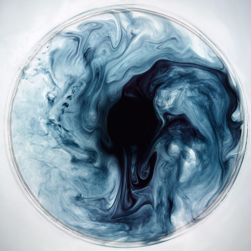
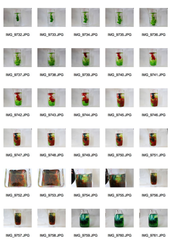
My Response
For this shoot my aim was to take inspiration from Dan Tobin Smith and copy the style he uses to take his ink images.
|
|
To create these images I had poured different colored ink into a jar with water and placed it in front of a blank background. I then took a burst of photos of the colors intertwining and mixing with the water.
WWW: I was able to capture the movement of ink in the water and played around with different angles. Also by using a white background it made the colors stand out a lot more.
EBI: I tried to crop some of my images like Dan Tobin Smith so you can only see the ink.
WWW: I was able to capture the movement of ink in the water and played around with different angles. Also by using a white background it made the colors stand out a lot more.
EBI: I tried to crop some of my images like Dan Tobin Smith so you can only see the ink.
Favorite Strand
Development 1
For my favorite strand I decided to develop my water strand because I had a lot of ideas.
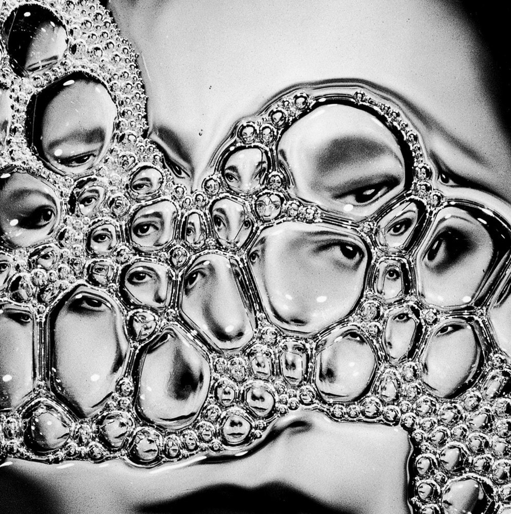
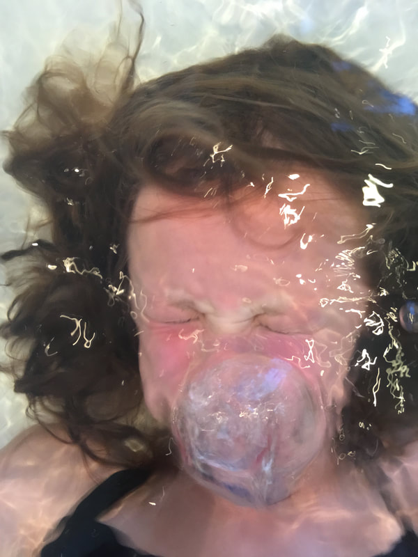
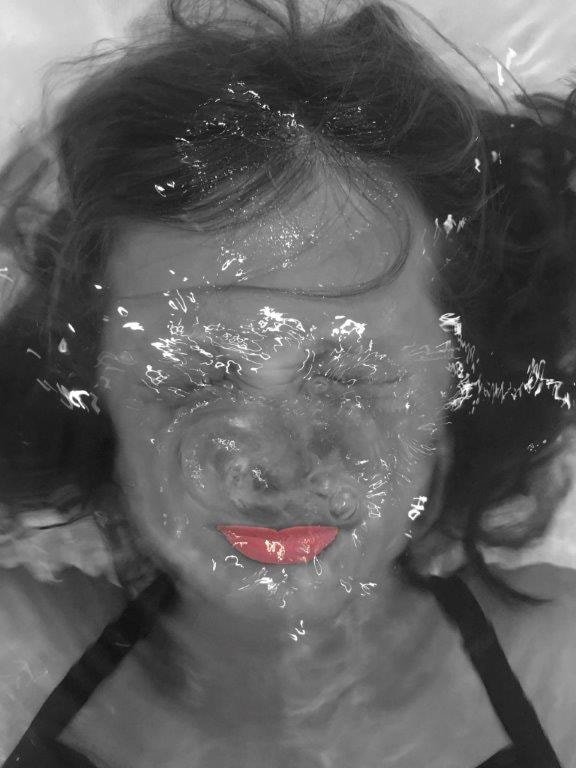
The artist that inspired my first development was Laurence Demaison. She was a self-taught photographer who began in 1990. She used herself exclusively as the model of her photographs. She struggled confronting her body image which is why instead of accepting it she tried to conceal, modify, destroy and reconstruct the images. This lead to a series of photographs that used reflective and distortive qualities.
She develops her photos in her own darkroom and makes no changes to the photographs after they are taken.
I find the middle image the most interesting as it reflects her face many times and focuses on a different feature of it in each different sized bubble. I also find the texture of this image unique.
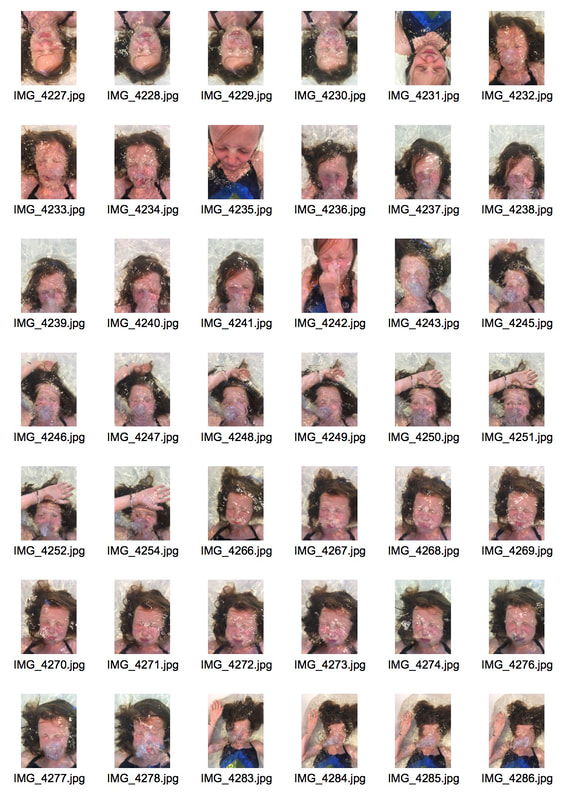
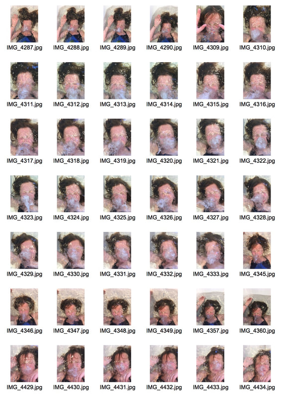
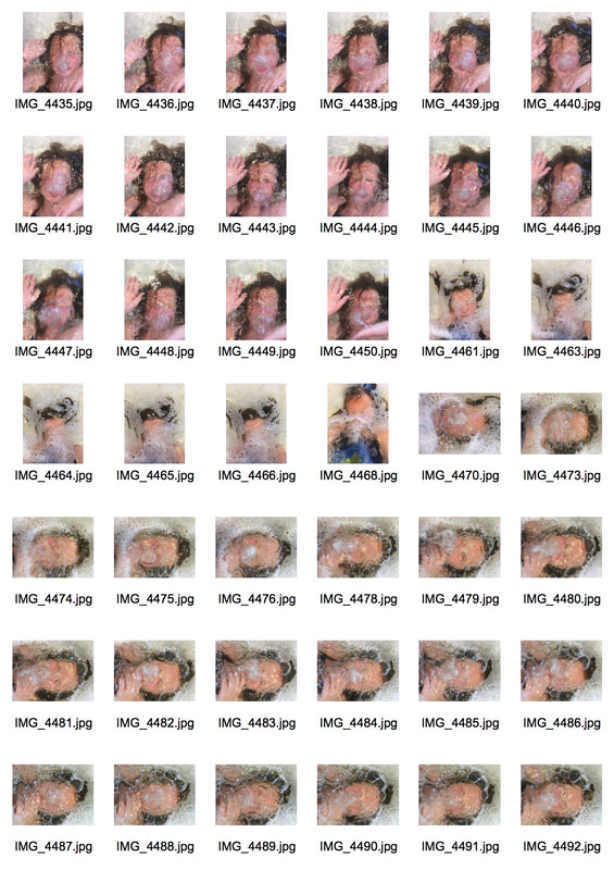
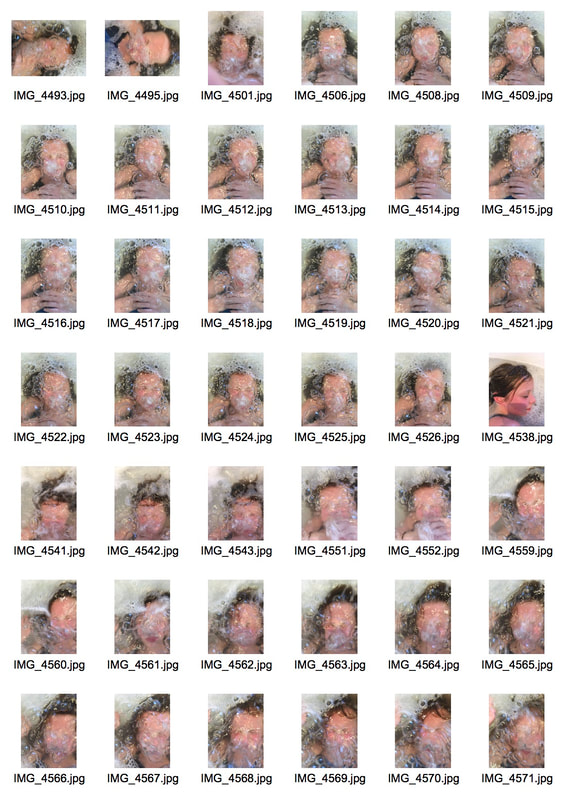
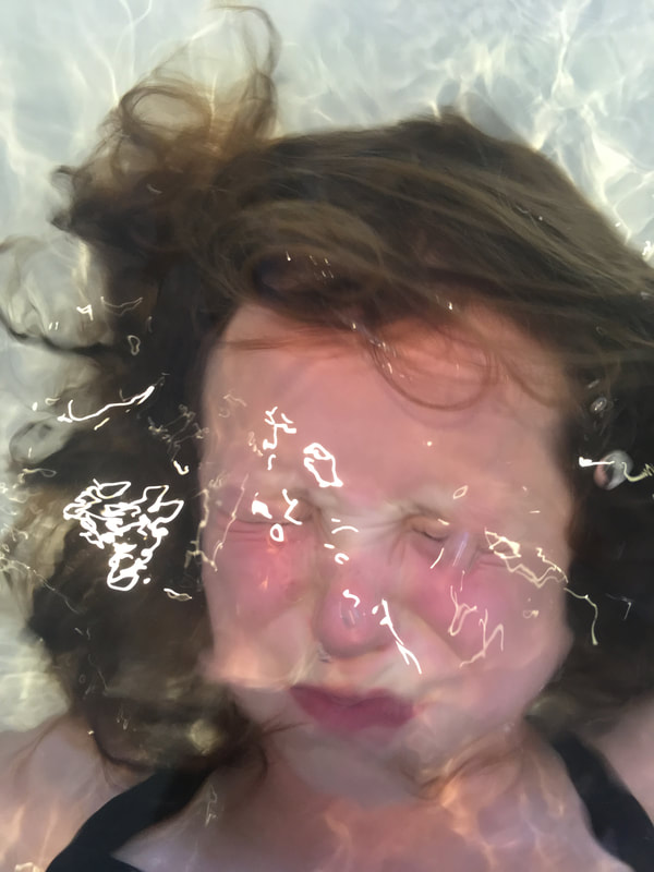
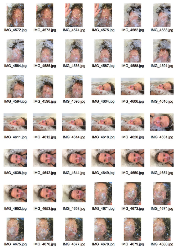
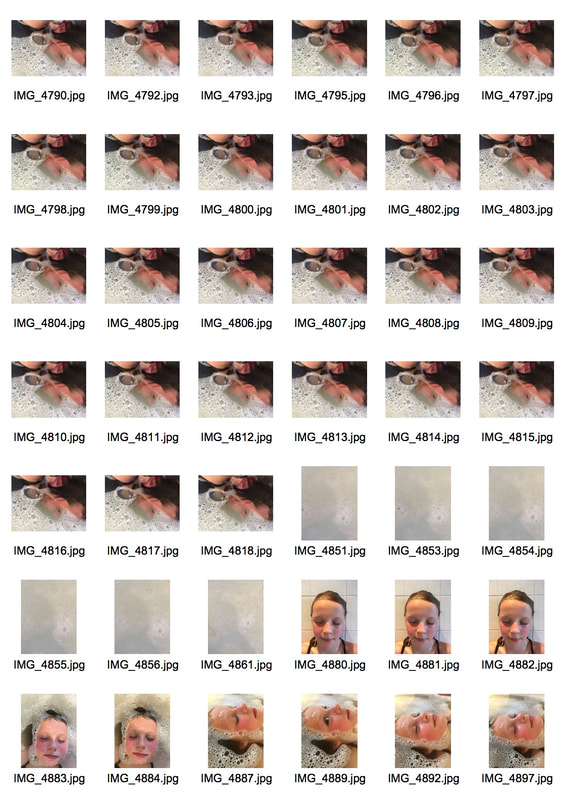
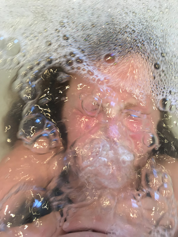
My response
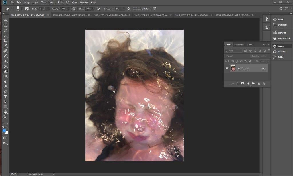
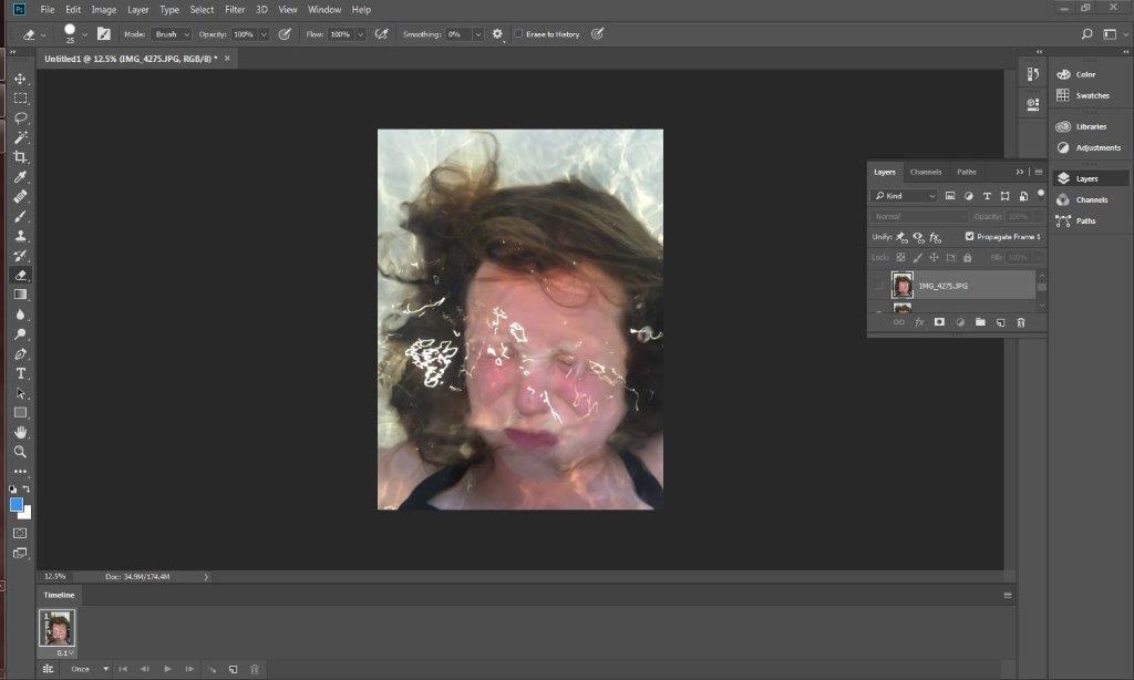
For this shoot my aim is to take a series of photos similar to Laurence Demaison, distorting the image of my subject through using water.
|
|
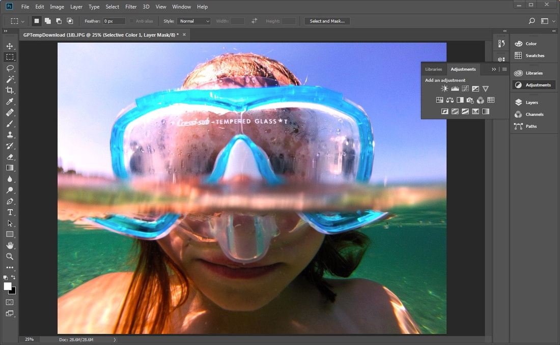
Final outcome force 02 |
Final Outcome force 01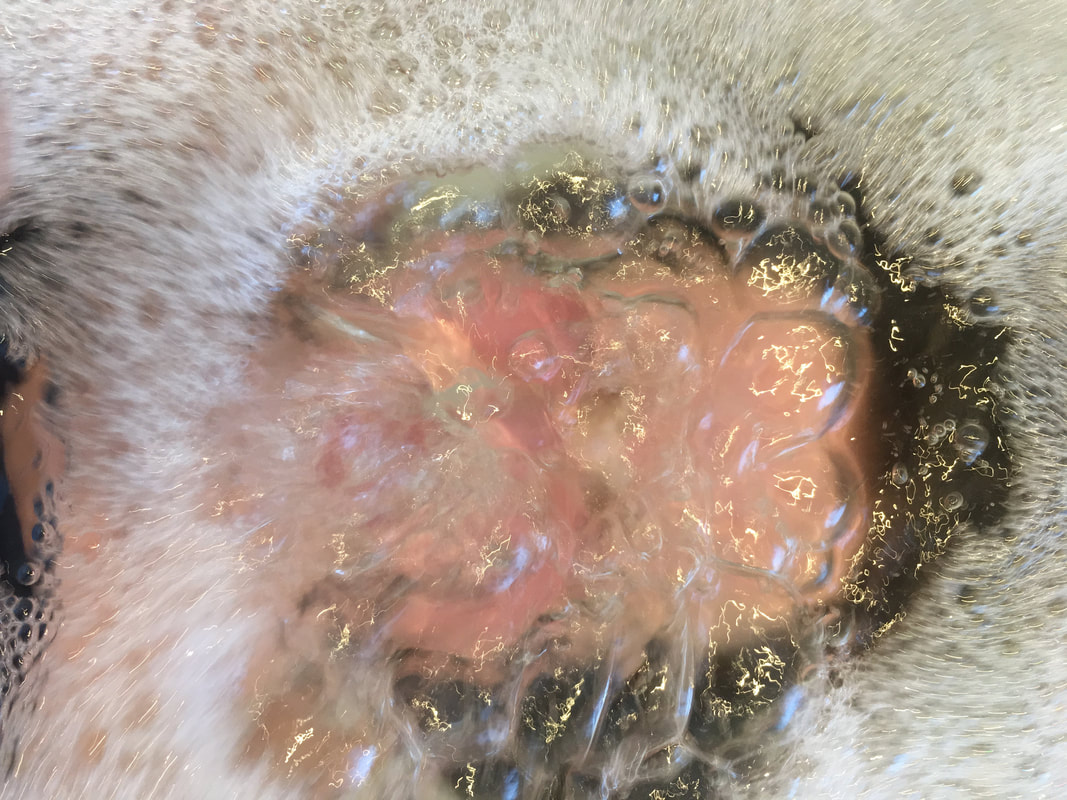
|
|
|
I took these photos using the burst mode on my camera to capture the way the water and bubbles moved around my subject.
WWW: I am particularly pleased with the way the water managed to distort my sister's face similarly to Laurence Demaison's photographs
EBI: I centered my sister in the middle of the frame and excluded the background in some of my images
WWW: I am particularly pleased with the way the water managed to distort my sister's face similarly to Laurence Demaison's photographs
EBI: I centered my sister in the middle of the frame and excluded the background in some of my images
Development 2
For my next development I decided to edit the images I had taken for development 1 to make them more interesting and unique.
|
|
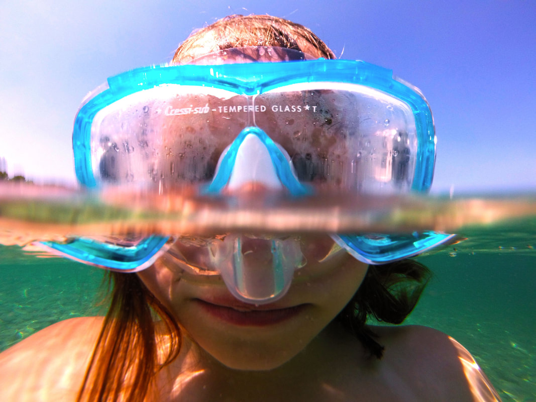
Final Outcome Force 03
Final Outcome Force 04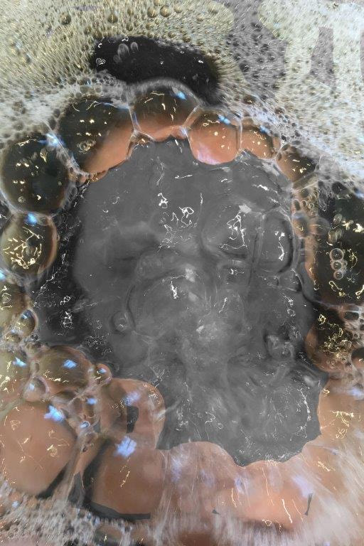
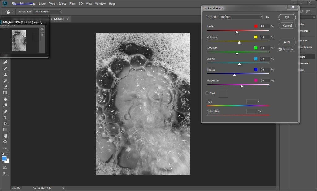
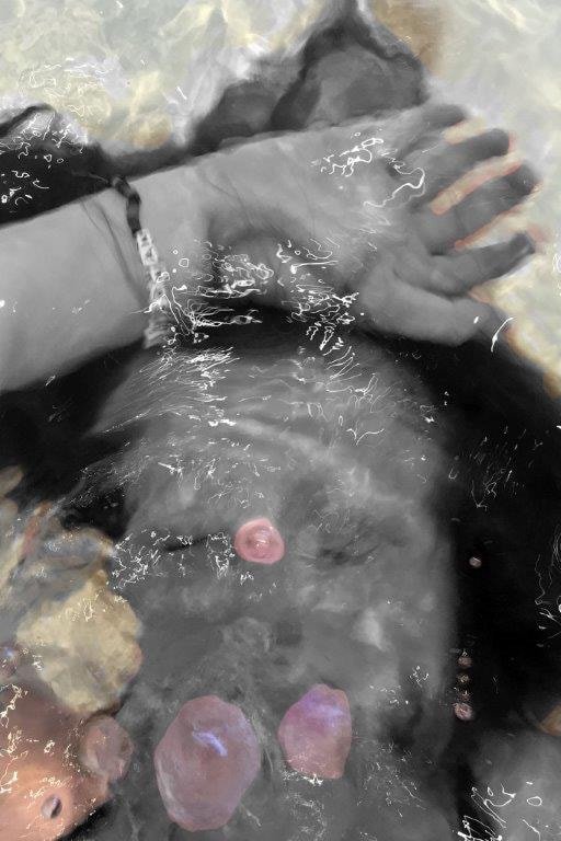
To create this photo I used photoshop. I wanted to create the effect that the bubbles were framing her face this added depth to the photo and made it more interesting to look at.
|
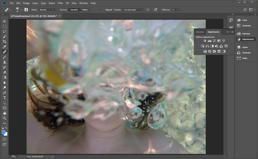
Final Outcome Force 05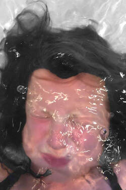
i I did the same thing with this photo but chose a different feature to highlight with colour.
|
Final Outcome Force 06
I did this using Photoshop. Layering the same photo on top of each other, turning the top layer to black and white while the background layer stayed the same and then then erasing parts of the photo I wanted to be in color. I particularly like this photo as it make the simple image appear a lot more complex.
WWW: I like how the end results show contrast between the black and white, and original photo, bringing out certain features of it.
EBI: I used a smaller sized eraser which would allow the images to be neater and keep the smaller details of the picture.
WWW: I like how the end results show contrast between the black and white, and original photo, bringing out certain features of it.
EBI: I used a smaller sized eraser which would allow the images to be neater and keep the smaller details of the picture.
Devlopment 3
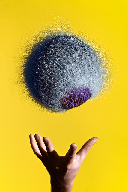
For my third development I decided to look at the artist Edward Horsford. Horsford's goal in photography is to capture things that happen to fast for us to see. He does this by using a high shutter speed and has to perfectly time the moments when each balloon bursts.
My Response
My intention for this shoot is to capture the shape of the water when it has been burst, similar to Edward Horsford.
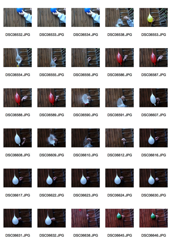
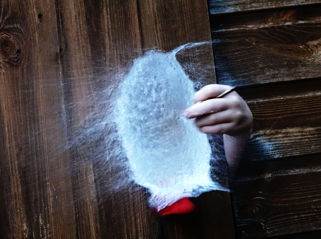
To make these images I tied my balloons from a string and then got somebody to poke it with a needle while I took a burst of photos.
WWW: I managed to capture the exact moment the balloons burst which meant they kept the shape of the balloon.
EBI: I made sure it was less pixelated.
WWW: I managed to capture the exact moment the balloons burst which meant they kept the shape of the balloon.
EBI: I made sure it was less pixelated.
Development 4
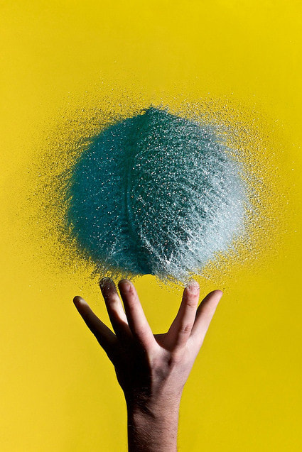
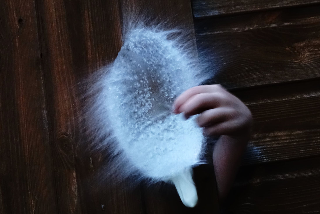
For this development I decided to expand on development 3 by adding food coloring to the water in the balloon to create a series of more interesting images.
|
|
For this development I decided to expand on development 3 by adding food coloring to the water in the balloon. To create a more interesting image.
WWW: The colors came out really bright and again I caught the water in the form of the balloon.
EBI: I used a white background so that the colors would create more of a contrast.
WWW: The colors came out really bright and again I caught the water in the form of the balloon.
EBI: I used a white background so that the colors would create more of a contrast.
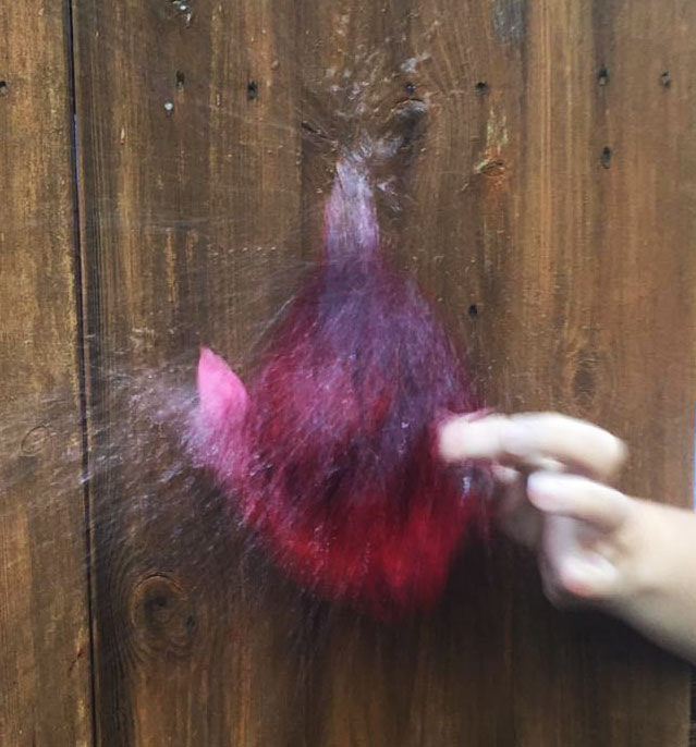
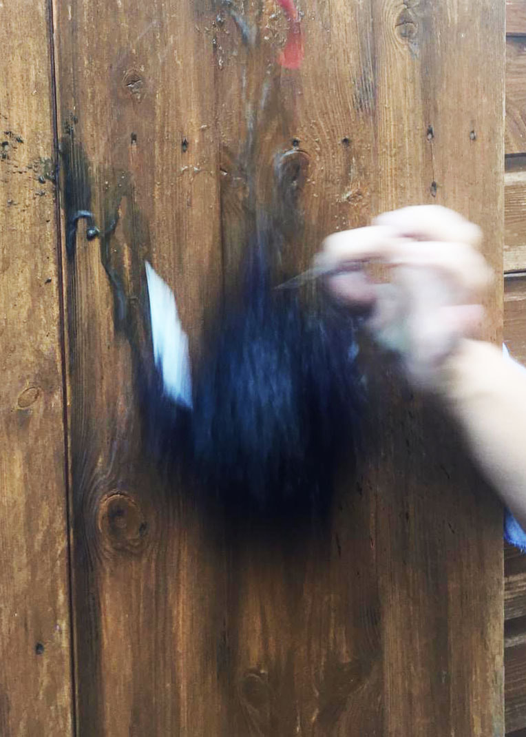
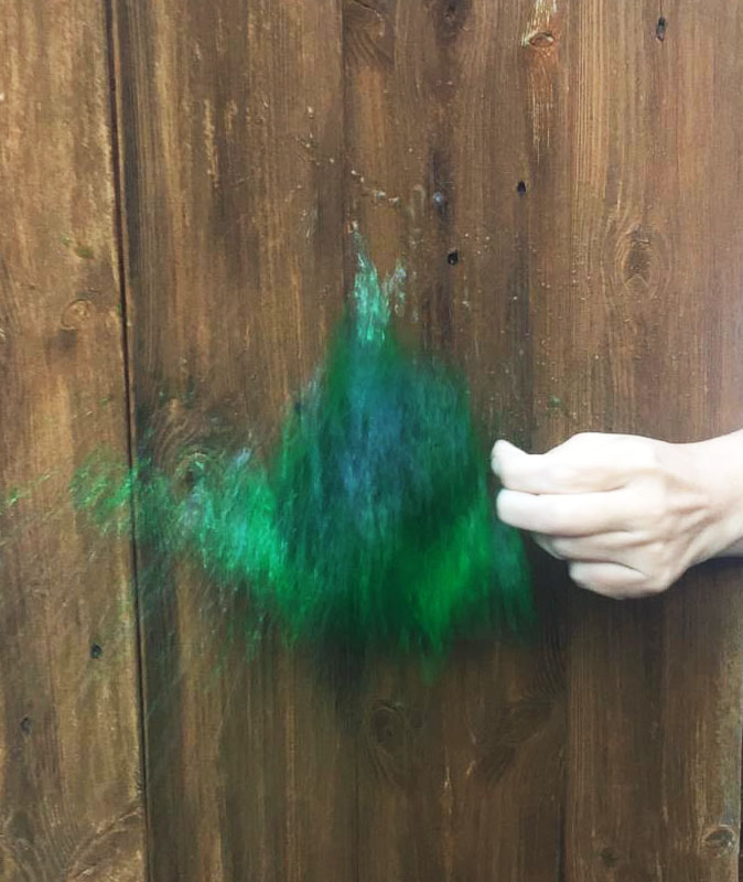
Development 5
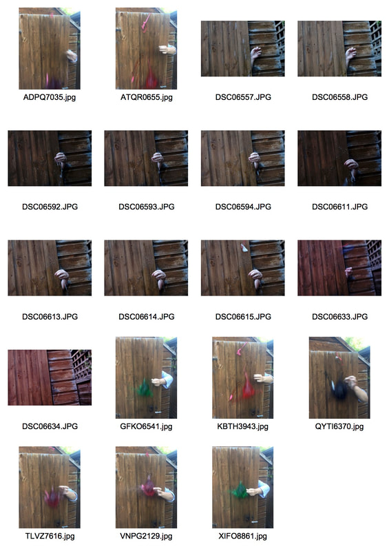
For my final development I got people to stomp on balloons. I wanted to see how the water would burst out and it could stay in the form of a balloon however failed to capture this.
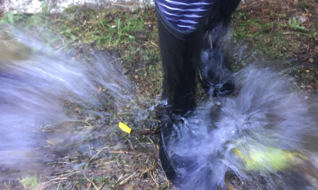
WWW: You can see the water spraying out.
EBI: I used a faster shutter speed
EBI: I used a faster shutter speed
Conclusion
After completing all my developments I think my favourite one was Development 2 because It was my own original idea and it shows a series of photoshopping skills.
